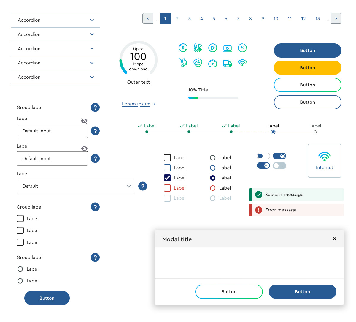
Creating the Elements
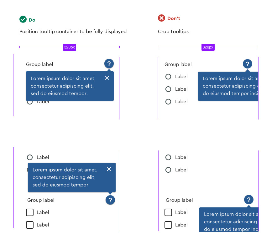
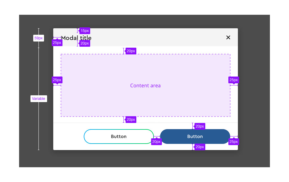
We began by designing the most common components used throughout Cox.com, such as buttons, form fields, icons, and modals. In addition to creating individual states for each component, we wrote detailed documentation on accessibility, correct usage, the anatomy of elements, best user experience practices, and interaction behavior.
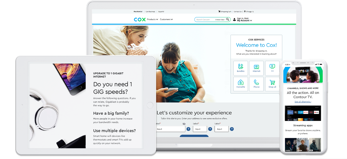
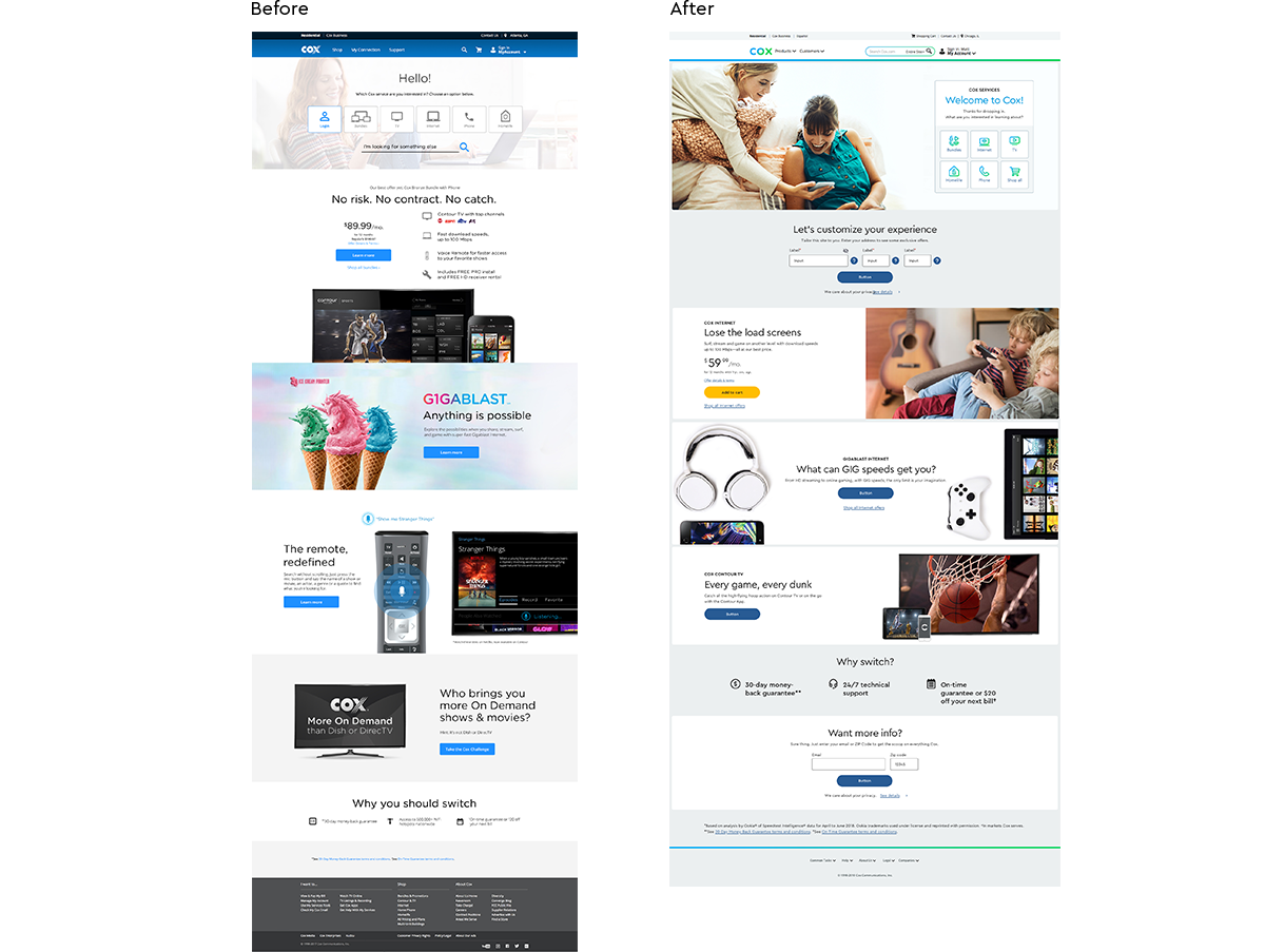
Consistency Through Modularity
The many teams that work for Cox Communications, from branding studios to the in-house development department, all needed to be able to work with this new design system. Though we had guidelines for specific components, to ensure that design layouts had a consistent visual look and worked across a multitude of digital products, we created a modular system of containers and content pods. Content pods included groupings of components that fit into containers. This system not only allowed for consistency, but also made building layouts more efficient.
Copywriters


